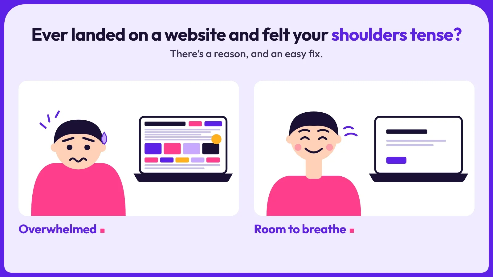
When I show a small business owner a first draft, one of the first things I hear is, “There’s a lot of empty space. Shall we fill it?”
Short answer: please don’t. That empty space is doing some of the most useful work on the page.
Credit where it’s due: I picked up this way of thinking from my former UX/UI colleague, Carrie. Her Instagram post on how good design accounts for the human body is well worth a look at.
What white space is
White space is the empty area around and between your words, pictures and buttons. It doesn’t have to be white. It can be any plain background colour. It’s simply breathing room.
Think of a shop window. One well-lit display makes you stop and look. A window crammed with everything in the shop makes you walk past.
Good design is felt, not just seen
A website isn’t only looked at. People feel it, and the body joins in.
Here’s how Carrie puts it. The moment someone lands on a page, their mind is already working out where to move next, before their hand does anything. A crowded page makes that job hard. Everything competes, the eye jumps about, and the brain has to work to decide what matters. Designers call that effort cognitive load: the mental work needed to make sense of something.
When that load is high, the body notices. People can feel tense, tired or overwhelmed, often without knowing why, and then they leave. When the load is low, the nervous system can settle. The way forward is clear, and the visit feels easy.
That feeling of being overwhelmed is what a crowded website gives people: too many things asking for attention at once.
That’s what white space gives you: room to breathe, for your customers as much as for your design.
Why it helps
It makes your text easier to read. Short paragraphs with space around them are far less tiring than a solid block of words. Most people scan a page before they read it, and space helps them scan.
It shows people where to look. When everything is shouting, nothing gets heard. Space around a heading or a button tells the eye, “this matters”.
It makes you look more professional. A crowded page can feel chaotic, even when the business behind it isn’t. A calm page feels capable. That matters when someone is deciding whether to ring you or the next business on the list.
It works better on phones. On a small screen, buttons and links need room around them so they’re easy to tap with a thumb.
It’s kinder to people. Behind every visit is someone who is busy, a bit stressed and in a hurry. A calm page respects that. They feel looked after, and feelings are what people remember when they decide who to call.
“But I’m wasting the space”
This is the worry I hear most. People are used to print, where every page costs money. A website has no page limit, and everyone scrolls all day on their phone. Scrolling is normal. A cluttered page that nobody reads is the real waste.
Five quick fixes to try
- One message per section. If a section is trying to say two things, split it into two.
- Bigger gaps between sections. Add more space than feels natural. It will look right once you’ve looked at it for a day.
- Shorter paragraphs and shorter lines. Two or three sentences each, with a little extra space between lines.
- One main button per page, with room around it. If everything is a button, nothing is.
- Take one thing away from every crowded section. An extra badge, a third image, a sentence that repeats the one above.
A quick test
Step back from your screen and squint. Can you still make out the main heading and the main button? If it’s all one grey blur, the page needs more space.
Then notice how the page feels. Do your shoulders drop, or do they tense up? Your body usually knows before you can say why.
White space isn’t the same as empty
Space needs a purpose. A big blank page with nothing useful on it isn’t good design either. The aim is a page that says one clear thing at a time.
Want a second pair of eyes?
If you’re not sure whether your website is too busy, try the assessment tool, or have a look at what a web designer in Cheshire can do for small businesses. You can also read about our services, or tell me about your business and I’ll take a look at your site and give you an honest view.
Small business sites, sorted.